Clarity, confidence and a website that reflects it

Case Study: Audrey’s Consultant Services

Helping a veteran + leadership consultant turn decades of experience into a warm, trustworthy brand with presence and polish.

Project snapshot

Client overview

Who they are

Audrey offers substance abuse evaluations and coaching to DOT non-compliant individuals and professionals navigating change, growth, or new direction. She needed an online home that conveyed wisdom, approachability, and professionalism without corporate coldness.

The challenge

She didn't have a cohesive brand presence - just a collection of docs, email threads, outdated Facebook and dated business cards. Her business was built on trust and referrals, but her materials didn't reflect her expertise or warmth. She needed a simple but strategic system that felt like her.

Pictured above: Audrey’s outdated business card and only branded item.

Our approach: how the Blueprint became reality

🎯 Strategy
  • Develop a visual identity that feels grounded, calming, and credible
  • Structure a one-page site that’s easy to navigate and explains services clearly
  • Create tools that help her serve clients efficiently and professionally
🔧 Process highlights
  1. Discovery: Brand tone-mapping and core values conversation
  2. Logo Design & Color Palette (soft blues and purples, grounded neutrals)
  3. Web Strategy & Content Framework (WordPress + Elementor)
  4. Light SEO setup for name and service findability

🏁 Testing & launch

We tested across mobile and desktop to ensure clarity and usability, then delivered a guide for managing future edits. Basic SEO and image compression were implemented for fast loading and crawlability.

What we achieved

✅ Visual Brand Identity: Gave Audrey consistency across site, docs, and referrals

✅ Website with Clear Navigation: helps clients understand her unique value immediately

✅ Branded Tools & Materials: Boosted her professionalism with branded business cards and forms

✅ Completed in 2 Months: From launch to post-support, the project was clear, collaborative, and efficient

Project gallery

More work like this

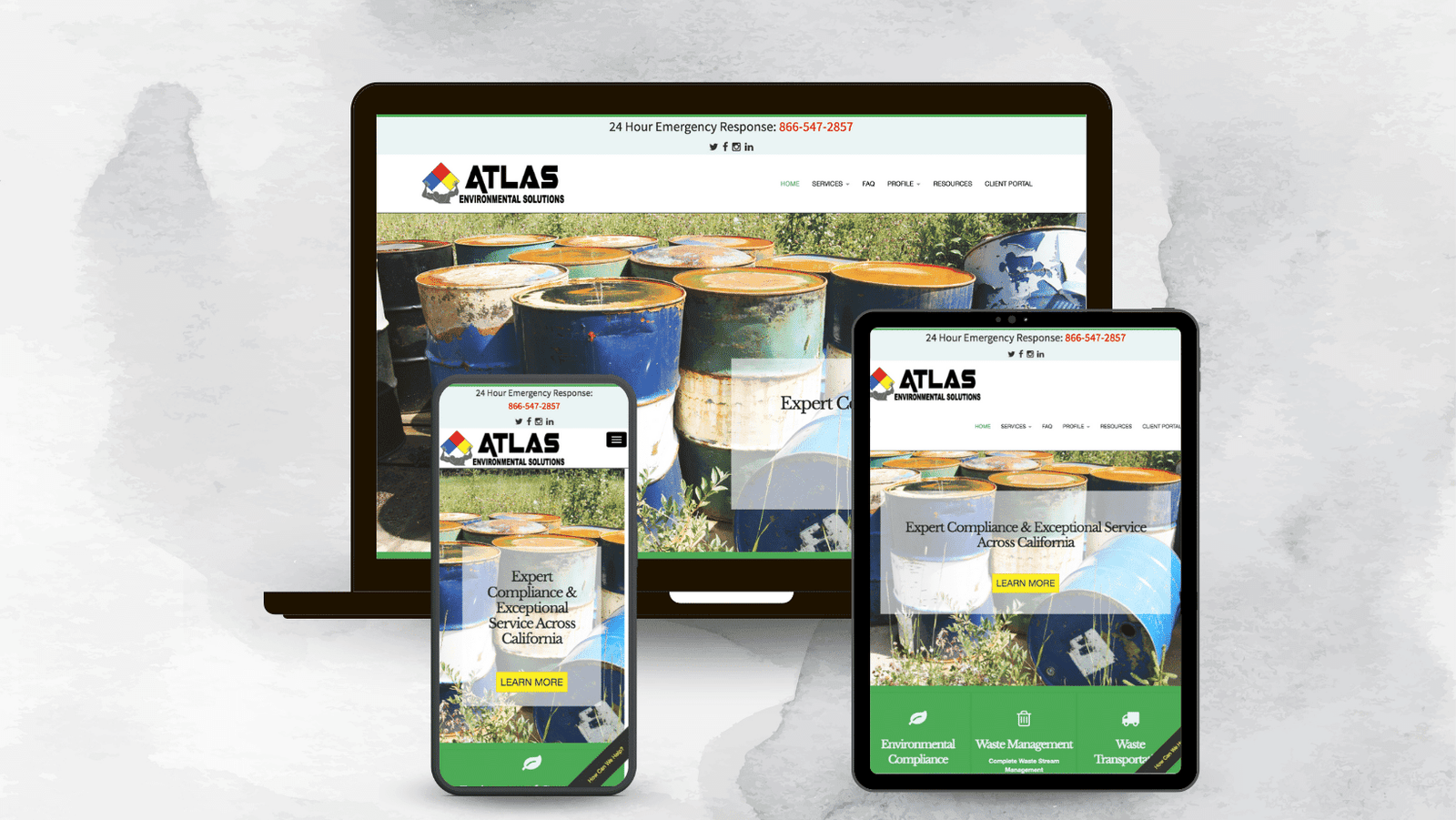
Clean and modern atlas environmental website redesign by Unfold Creative House

Atlas Environmental: Automating Client Workflow

Atlas Environmental came to Unfold for a modern, professional web presence. We delivered a clean website, consistent brand visuals, and refined service messaging to better connect with their ideal audience and establish trust from the first click.

Business card design for Resilient Fitness from TM Media Concepts

Resilient Fitness: Unifying Brand with Sales

Resilient Fitness helps adults recovering from injury or looking to amp their fitness journeys with OT-led personal training but did not have a professional presence. What started as a logo design, unfolded into developing a fresh brand identity, a tailored website, & branded prints to reflect their welcoming, adaptive approach to fitness.

Ready to shape a brand that reflects your mission and moves you forward?

Contact us for a free consultation to see if we’re a great match for your project.